


Key takeaways:
- Interactive demos and timelines reduced cycle time by over 30%
- Pricing, FAQs and feature breakdowns consistently improved deal velocity
- Personalisation - through video or voice - made content more memorable and effective
- Interactive Pods create clarity, confidence and internal alignment
We’ve all been there.
A buyer opens your sales deck, scrolls once, then disappears. You follow up. Nothing.
It’s not that they’re not interested. It’s that static content doesn’t always hold attention - especially in deals involving multiple stakeholders, with varied priorities and buying questions.
At trumpet, we analysed thousands of Digital Sales Rooms (Pods) and found that certain types of interactive, buyer-friendly content do more than just engage. They significantly reduce sales cycle length, in some cases by over 30%.
Let’s dig into what actually works, and how you can use it to accelerate your pipeline.
The problem with static content
Traditional decks and PDFs aren’t going away. But they come with limitations:
- They’re passive
- They don’t personalise well
- They don’t invite exploration
- They assume one-size-fits-all
In a modern sales process where buyers expect more autonomy, static content forces them to interpret the pitch for others - and that slows things down.
Interactive content, on the other hand, gives them tools to explore and self-educate.
The data: interactive Pods move deals along faster
Here’s what the data told us:

- Deal timelines → Deals closed 33% faster
- Interactive demos → Deals closed 31% faster
- Feature breakdowns → Deals closed 21% faster
- Clear pricing sections → Deals closed 19% faster
- FAQs → Deals closed 15% faster
- Personalised video imports → Deals closed 14% faster
Plus, interactive content in Pods increase likelihood of closing...
- Pods with embedded calendars
→ +8% win rate - Pods with a deal timeline
→ +7% win rate - Clear pricing sections
→ +2% win rate - Personalised voice notes
→ +2% win rate
These aren’t marginal gains. They show a consistent theme:
Buyers who can engage with your content directly move faster and convert more often.
Why interactivity works
Interactivity doesn’t mean flash. It means function.
Here’s what interactive content actually does:
- Speeds up internal conversation
Stakeholders can see answers to questions without waiting for follow-up.
- Reduces friction
No need to request more info or ask for yet another demo.
- Creates buy-in earlier
When buyers can self-navigate, they start to feel ownership earlier in the process.
- Builds trust
Transparency around pricing, timelines and product fit signals confidence.
Most importantly, it creates a Pod that feels like a decision workspace - not just a pitch deck.
What “interactive” actually means in a sales room
It’s not about animations or splashy design.
Here are practical examples of what worked in high-converting Pods:
1. Timeline Widgets
Give buyers a simple visual of how the process will unfold
Best used to align teams on next steps, sign-off phases and go-live dates.
2. FAQs
Anticipate objections.
A strong FAQ section answers the silent blockers - legal, technical, ROI - before they become slowdowns.
3. Interactive product demos
Allow prospects to explore features based on their priorities.
This is especially effective when paired with short explainer videos.
4. Personalised video and voice
Used well, these are a shortcut to trust.
A 60-second video summarising where you are in the process can drive a revisit and unlock stalled momentum.
5. Embedded calendar links
Removing friction from the next step often means the difference between progress and ghosting.
How to build interactive Pods that accelerate deals
Keep it buyer-led
Your Pod should be skimmable, clickable and structured to let the buyer take the lead.
Be concise and clear
Each section should answer a real question or objection. Don’t include content for the sake of it.
Mutual Action Plan content to stage
Don’t show onboarding timelines at the top of the funnel. Save late-stage detail for when it adds real confidence.
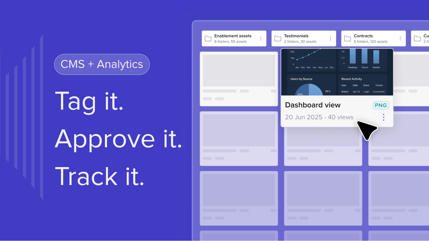
Use trumpet analytics to guide improvements
See where buyers are clicking, what they revisit, and where drop-off happens. Optimise accordingly.
What not to do
- Don’t confuse interactivity with noise
Just because it moves doesn’t mean it helps. Animation isn’t the goal - clarity is.
- Don’t overload your Pod
More content isn't better. Well-placed, relevant content is what drives engagement.
- Don’t bury key assets
Make pricing, timelines and FAQs easy to find. Think like a buyer, not a seller.
Final thoughts: The best Pods don’t just inform, they empower
When buyers can explore on their terms, find answers fast and share content that speaks to every stakeholder, deals move with less friction and more confidence.
Interactive content isn’t a gimmick. It’s how modern selling gets done. Build for exploration, not explanation - and let your buyers take the lead.


![How to Get Started with Buyer Enablement [With Examples]](https://cdn.prod.website-files.com/65cf4fecbed2754c2236665d/65cf4fecbed2754c22366bdb_65a5af83e742f76e34ce06f3_Customer%2520Onboarding%2520_%2520Everything%2520you%2520need%2520(2).png)
.png)


.png)


.png)


.png)


.png)

.png)
.png)


